On-strip heartbeat annotations: RR intervals and heart rate on Apple Watch ECG
This is the feature ECG+ was born with. Since version 1.0, released May 19, 2021, ECG+ has printed a small marker directly on top of every heartbeat in your Apple Watch ECG, and written, between each pair of beats, the exact time from one beat to the next and the heart rate that timing works out to. It turns a wavy line into something you can actually read, and it's the clearest way we know to demystify HRV: instead of a single mystery number, you see the real beat-to-beat math it's built from.
What ECG+ marks on each heartbeat
Every heartbeat has one sharp, unmistakable landmark: the tall spike of the QRS complex, known as the R peak. It's the moment the ventricles fire and the heart actually pumps. ECG+ detects that peak (or valley, if your recording is inverted) on every beat and prints a dotted R marker right on top of it, so you can see at a glance where each beat falls.
From there it adds two numbers in the gap between every pair of beats:
- The RR interval: the time, in milliseconds, from one R peak to the next. This is the fundamental unit of heartbeat timing; everything about rhythm and variability is built from it.
- The instantaneous heart rate: what that single RR interval works out to in beats per minute (60,000 ÷ the RR interval in ms). It's the heart rate for that one beat, not an average for the whole strip.
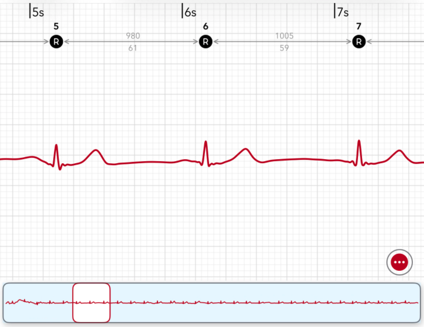
Each beat carries a dotted R marker and a number. Between beats 5 and 6 the gap is 980 ms (61 bpm); between 6 and 7 it's 1005 ms (59 bpm), the same recording, but a slightly different heart rate from one beat to the next.
Reading the strip
Look at the example above. Beats 5, 6 and 7 each sit under their own R marker. The space between beat 5 and beat 6 is labelled 980 ms on top and 61 underneath; the next gap is 1005 ms and 59. Read it left to right and a story appears: the heart took 980 milliseconds to come round for one beat, then 1005 milliseconds for the next, 25 milliseconds slower. That tiny difference is the heart rate drifting from 61 down to 59 bpm in the space of a single beat.
That drift is not an error or a sign of trouble. A healthy heart never ticks like a metronome: it constantly speeds up and slows down a little as you breathe, relax or tense. The annotations let you see that happening, beat by beat, instead of taking it on faith.
From R markers to A and V: spotting premature beats
The R marker tells you where a normal beat lands. But not every beat is a normal one, some arrive early, out of the heart's usual rhythm. So in version 1.2, released July 12, 2022, ECG+ added possible premature-beat identification, and with it two new on-strip icons that take the place of the plain R when a beat looks early:
- A: a possible premature atrial contraction (PAC), an early beat that starts in the heart's upper chambers (the atria).
- V: a possible premature ventricular contraction (PVC), an early beat that starts in the lower chambers (the ventricles).
Because the marker sits right on the beat, an early beat stops being a number buried in a summary: you can see it land out of step with its neighbours, and the RR intervals on either side show exactly how early it came and the pause that followed. The same annotations that explain HRV double as a map of where premature beats fall across the recording.
Premature beats often don't arrive at random: they fall into repeating patterns. So in version 1.14.1, ECG+ extended the feature again with a pattern link-line marker that ties the beats together and names the rhythm directly on the strip: bigeminy (every other beat early), trigeminy (every third), quadrigeminy (every fourth), and runs of consecutive early beats like couplets and triplets. Instead of leaving you to spot the rhythm yourself, ECG+ names it where it happens.
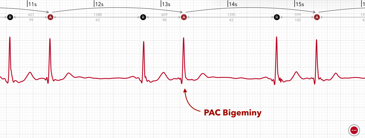
Pattern marking in action: each early beat carries its A marker, and ECG+ labels the repeating rhythm on the strip: here a PAC bigeminy, where a premature beat lands every other beat.
From a single dotted R to A and V icons to named beat patterns, it's all the same idea taken further: not just a verdict at the top of the report, but the evidence drawn right onto the recording, beat by beat.
How this demystifies HRV
Heart rate variability (HRV) usually arrives as a lone figure, "HRV 29 ms", with no hint of where it came from. The on-strip annotations are the antidote. HRV is, quite literally, a summary of how much those RR intervals differ from one beat to the next. When you can read every RR interval on the strip, the HRV number stops being a black box: it's just a measure of how much the 980s and 1005s scatter around.
ECG+ also draws that scatter for you as a Poincaré plot: the second piece of the same picture. Each beat's RR interval is plotted against the next one's, turning a whole recording of intervals into a single cloud of dots.
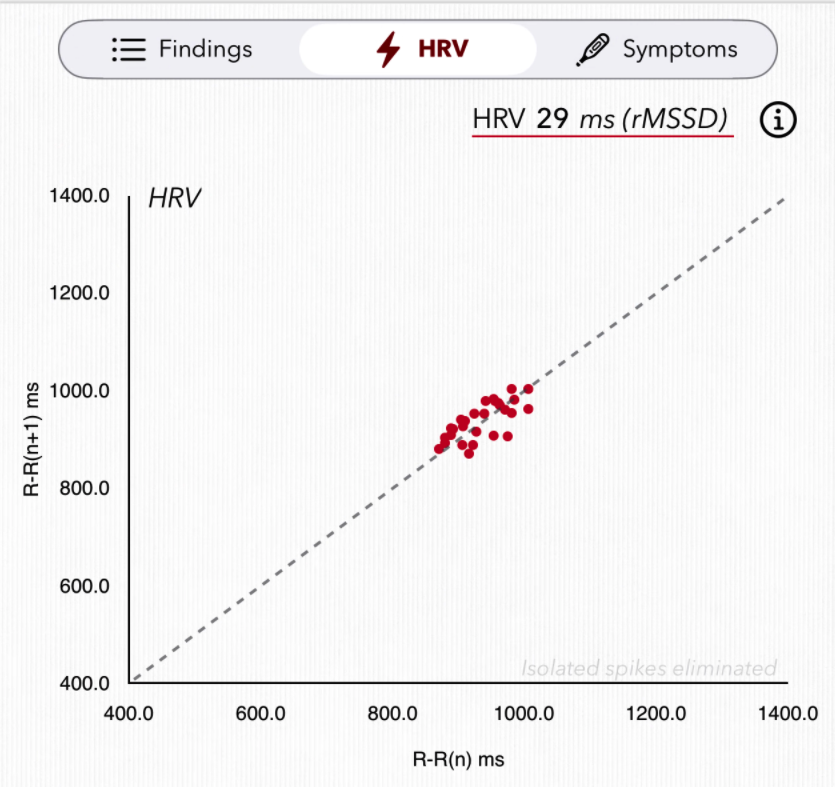
The Poincaré plot: every dot pairs one RR interval with the next. A tight cluster hugging the diagonal means steady, even beats (lower HRV); a looser, more spread-out cloud means more variability (higher HRV). Here the rMSSD works out to 29 ms.
- A tight cluster along the diagonal means each beat is close in timing to the one before it, a steady rhythm and a lower HRV.
- A wider, more scattered cloud means the intervals jump around more from beat to beat, more variability and a higher HRV.
- The shape itself tells a story: a comet, a fan or stray outliers can flag premature beats or irregularity that a single number would hide.
Between the marked strip and the Poincaré plot, HRV goes from an unexplained statistic to something you can trace with your own eyes: the timing of each beat, the spread of those timings, and the one number that sums it all up.
Why it was the first thing ECG+ ever did
The annotations weren't bolted on later: they shipped in the very first release because they capture what ECG+ is for. Your Apple Watch shows you a clean, anonymous waveform. ECG+ labels it: where each beat is, how far apart they fall, and what that means. Once the strip is annotated, the rest of what ECG+ does, flagging PACs and PVCs, measuring QT/QTc, tracking premature-beat burden, all builds on the same simple idea: show the user exactly what's in their recording, not just a verdict.
Note: the instantaneous heart rate next to each beat is the rate for that single interval and will differ from the average heart rate for the whole recording: that's expected. The annotations and HRV here are for understanding your own recording and general wellbeing insight, not a diagnosis; see the disclaimer and talk to your doctor about any health concerns.